Does CAPE Actually Predict Stock Returns?
CAPE explains 30% of 10-year returns in-sample, but goes sharply negative out-of-sample when tested honestly. Today's CAPE sits off the chart it was fit on.
The 4% rule post and the bad-first-decade post both cited today’s CAPE — 35.2 — as a fact about where valuation sits historically: the 97th percentile, exceeded only by the 1999–2000 dot-com peak. Neither ever tested whether CAPE actually predicts anything. This pays that debt off.
The current search results for this question are dominated by academic PDFs making strong claims — one widely cited figure says CAPE “explains 85% of the variation” in 10-year returns since 1975. Reproducing that exact number takes reproducing its exact specification, which this post doesn’t have. What it can do instead: build the same kind of regression from scratch on this site’s own data, check whether the fit actually holds over the full sample or just a favorable window, and then ask the question an in-sample R-squared cannot answer — does a relationship fit on the past actually forecast the future it hasn’t seen yet?
Predictive power does increase with horizon — this part replicates cleanly
Starting CAPE against the market’s subsequent annualised real return, at four horizons, across every overlapping monthly start from 1926 to as recently as each horizon allows:
| Horizon | Correlation | R-squared |
|---|---|---|
| 1 year | −0.200 | 4.0% |
| 5 years | −0.365 | 13.3% |
| 10 years | −0.552 | 30.5% |
| 20 years | −0.585 | 34.2% |
This part of the popular claim holds up: a higher starting CAPE really is associated with lower subsequent returns, and the relationship gets stronger, not weaker, the further out you look. At 1 year CAPE explains almost nothing — a valuation that looks expensive can stay expensive (or get more so) for a long time before it means anything for next year’s return. By 10 and 20 years the relationship is real and substantial. None of this is new — it’s the standard finding behind every CAPE-based retirement calculator — but it’s now built from this site’s own data rather than taken on faith.
The specific “85%” figure doesn’t reproduce, even in its own window
| Sample | N | R-squared (10-year horizon) |
|---|---|---|
| Full sample (1926–2016 starts) | 1,079 | 30.5% |
| Since 1975 only | 497 | 57.3% |
| Before 1975 only | 582 | 55.4% |
Restricting to the post-1975 window the “85%” figure is supposedly computed on gets 57.3% here — a meaningfully better fit than the full sample, but not close to 85%. That gap is very likely a specification difference (annual vs. monthly sampling, price return vs. total return, CAPE level vs. log-CAPE, or a slightly different window), not evidence that either number is fabricated. But it’s a useful, checkable illustration of how much a headline R-squared in this literature depends on exactly how it’s computed — which is itself a reason to hold any single cited figure loosely.
The more interesting fact in that table: both sub-periods fit noticeably better on their own than the pooled full sample does. That’s not a contradiction — it’s a sign the CAPE-return relationship itself shifted somewhere around the split, enough that forcing one line through both eras explains less than either era’s own line would. Which sets up the real test.
The question an in-sample R-squared can’t answer
Fit the 10-year relationship on the first half of history only, then apply that exact, frozen line to the second half — data it never saw while fitting:
| R-squared | |
|---|---|
| In-sample (fit and evaluated on 1926–1971 starts) | 59.5% |
| Out-of-sample (applied to 1971–2016 starts, unseen) | −193.2% |
A negative out-of-sample R-squared means the fitted CAPE line predicted the second half worse than simply guessing the first half’s historical average return for every single one of those years — worse than knowing nothing except “returns tend to average about X%.” A relationship that explains 59.5% of its own training data collapses into something worse than a coin flip the moment it has to forecast data it wasn’t fit on. This isn’t a fluke of one split point:
| Split | Fit on | Forecasts (unseen) | Out-of-sample R-squared |
|---|---|---|---|
| 30/70 | 1926–1953 | 1953–2016 | −57.8% |
| 50/50 | 1926–1971 | 1971–2016 | −193.2% |
| 70/30 | 1926–1989 | 1989–2016 | −324.2% |
| reversed | 1971–2016 | 1926–1971 (unseen) | +15.6% |
Two things stand out. First, forecasting forward in time gets worse the more recent the test window — predicting 1989–2016 from a line fit on 1926–1989 data is the worst result on the page. Second, running the same test backward — fitting on the recent half and forecasting the older half — actually works reasonably well (+15.6%). That asymmetry is the whole story in miniature: a relationship estimated mostly from a lower-CAPE regime extrapolates badly to a higher-CAPE regime it never saw, while the reverse is far less damaging. CAPE’s typical range has drifted structurally higher since the 1990s; a line drawn mostly through single-digit-to-teens CAPE readings has no real information about what happens at 35, because almost nothing in its training data looked like that.
Does any of this translate into a usable rule?
A simple, honestly-tested version: hold 100% stocks whenever CAPE is at or below its own trailing median so far; drop to 60/40 when it’s above. The threshold is an expanding window — it only ever uses CAPE data that would actually have been available at the time, not the full-sample median computed with hindsight.
| Strategy | Total growth | Annualised | Max drawdown |
|---|---|---|---|
| Static 100% stocks | 14,108.85× | 10.22% | −83.7% |
| Static 60/40 | 2,826.21× | 8.43% | −63.0% |
| CAPE-switching rule | 3,413.70× | 8.64% | −80.3% |
The rule spent 64% of the sample’s months in the “expensive” (60/40) regime — CAPE has been above its own trailing median more often than not for most of the last century. Against static 60/40, that modest tilt paid off slightly: 8.64% versus 8.43% a year. Against just holding 100% stocks the entire time, it lost badly — giving up more than three-quarters of the terminal wealth. And the drawdown protection it was nominally buying barely showed up: −80.3% is not meaningfully better than −83.7%, despite being in a lower-risk allocation nearly two-thirds of the time. A mechanical CAPE rule spent most of history holding back from stocks and got almost none of the crash protection that decision was supposed to buy.
Where today’s CAPE actually sits
| Most recent available CAPE (September 2024) | 35.2 |
| Highest CAPE any 10-year training observation ever started at | 44.2 |
| Share of the 1,079 training starts with a lower CAPE than today | 97% |
| Full-sample line, evaluated mechanically at CAPE 35.2 | +0.3%/yr real, over 10 years |
| Residual spread around that line | ±4.2%/yr |
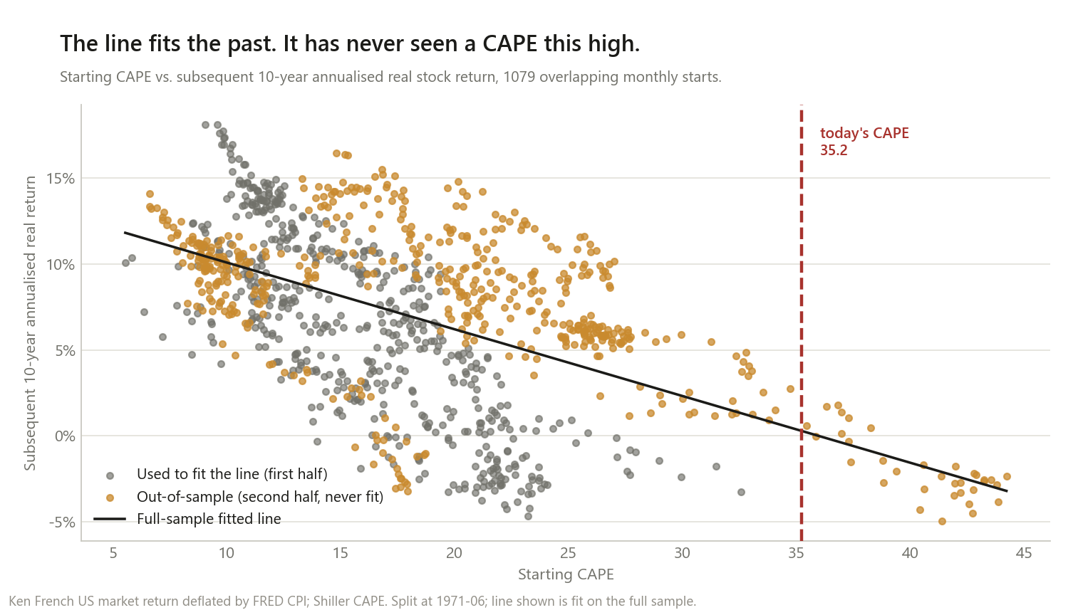
Taken mechanically, the fitted line says the next 10 years should average roughly +0.3% a year in real terms — essentially flat. I want to be careful about how much weight that single number can carry. Section three of this post just demonstrated, directly, that this exact kind of extrapolation — applying a line fit mostly on lower-CAPE data to a valuation regime it barely saw — is precisely where this relationship has historically failed worst. Only 3% of the training data sits above today’s level, and the residual spread around the line (±4.2% a year) is wide enough that the honest answer is closer to “a very wide range centred somewhere well below average” than “0.3%.” This is not a forecast — as the 4% rule post already said about CAPE, this site doesn’t make those. It’s a mechanical description of what a relationship, applied outside the density it was ever tested in, produces — alongside the specific reason that number deserves real skepticism.
What this does and doesn’t change
It does mean CAPE has genuine, replicable predictive power at long horizons. The 10- and 20-year R-squared figures are real, not an artifact of one favorable time window — they show up in the full sample, not just a cherry-picked slice.
It does not mean that power is usable as a forecast, honestly tested. The out-of-sample results are the central finding of this post: a relationship that explains 59.5% of its training data can still forecast worse than the historical average once it has to generalize to data it didn’t see — and it does exactly that here, badly, in the specific direction (old data predicting new) that matters for using it today.
It does not mean valuation-based timing is a free lunch, even ignoring the forecasting problem. The no-lookahead switching rule modestly beat static 60/40 and clearly lost to static 100% stocks, while barely improving on its worst drawdown despite avoiding the market most of the time.
It does mean today’s starting point is somewhere this relationship has almost never been tested. Not a prediction of what happens next — a fact about how thin the historical evidence gets exactly where it would matter most right now.
Method notes and limitations
- Real total returns, not price returns. Forward returns compound the Ken French US market series (dividends included) and deflate by realised CPI, matching the convention the 60/40 post and the retirement cluster already use.
- Overlapping monthly windows, not independent trials. The same caveat that applies to every rolling-window post on this site applies harder here: a 10-year window only fits into a 100-year sample about 10 times without overlapping itself, so the 1,079 “observations” behind each R-squared are nowhere near 1,079 independent data points. This is exactly why the out-of-sample test — which never lets information leak between the two halves — matters more than any single R-squared figure on this page.
- No formal significance testing (t-stats, p-values) is reported for the CAPE regressions. Standard errors for overlapping-window regressions require corrections (Newey-West with lags comparable to the horizon) that get unstable at 10- and 20-year horizons relative to the sample’s true independent-observation count. R-squared and, especially, the in-sample/ out-of-sample comparison are more honest tools for this specific problem than a p-value would be here.
- The switching rule is one simple, illustrative rule, not an optimized strategy — an expanding-window median with a 100%/60% split. A different threshold, allocation spread, or rebalancing frequency would produce different numbers; the qualitative result (weak edge over 60/40, clear loss to 100% stocks, little drawdown benefit) is unlikely to flip for small variations, but this post did not stress-test every variant.
- CAPE data runs through September 2024; the underlying stock/bond/inflation series run through June 2026, same vintage gap as the 4% rule post.
- US-only. No claim here about whether CAPE-style valuation predicts returns in other markets.
This is research, not personalised financial advice.
The code
The honest version of R-squared used throughout this post — fit only on a training set, scored against how well that training set’s own mean would have done on data it never saw:
def r_squared(x, y):
    """Simple OLS R-squared, y ~ a + b*x."""
    b, a = np.polyfit(x, y, 1)
    pred = a + b * x
    ss_res = np.sum((y - pred) ** 2)
    ss_tot = np.sum((y - y.mean()) ** 2)
    return 1.0 - ss_res / ss_tot, a, b


def oos_r_squared(x_train, y_train, x_test, y_test):
    """Fit on train, score on test -- against the TRAIN set's mean, not the test set's own."""
    _, a, b = r_squared(x_train, y_train)
    pred = a + b * x_test
    ss_res = np.sum((y_test - pred) ** 2)
    ss_tot = np.sum((y_test - y_train.mean()) ** 2)
    return 1.0 - ss_res / ss_tot, a, b
The difference between these two functions is the entire post. The first is what every CAPE whitepaper reports. The second is what actually tells you whether the relationship would have been useful in advance.
Data: the same Ken French / constructed-Treasury / FRED CPI series validated in the 60/40 post, plus Shiller’s CAPE already used for the valuation cut in the 4% rule post.
If you run a different specification and get a positive out-of-sample R-squared at the 10-year horizon, I want to see exactly what changed — that would be a real, checkable disagreement worth having.