The 10 Best Days Chart Is Missing Half the Story
Missing the 10 best days cost 55 percent. Missing the 10 worst days gained 140 percent. The famous chart only ever shows you one of those numbers.
Every brokerage produces some version of this chart. Stay invested in the S&P 500 and you earn 11.5% a year. Miss just the 10 best days and you earn 9.2%. Miss the 50 best days and you are down to 4.2%. The caption writes itself: nobody can time the market, so never sell.
I ran it. The numbers check out — in dollars, missing the ten best days since 1988 turns $671,332 into $298,660, a 55.5% haircut on a $10,000 starting stake.
Then I ran the other half, which I have never once seen printed next to it.
The half that never gets shown
| Days removed | Miss the best | Miss the worst | Miss both |
|---|---|---|---|
| Buy and hold | 11.51% | 11.51% | 11.51% |
| 10 days | 9.19% | 14.07% | 11.70% |
| 20 days | 7.66% | 15.92% | 11.92% |
| 30 days | 6.37% | 17.46% | 12.05% |
| 50 days | 4.18% | 20.15% | 12.25% |
Annualised return, S&P 500 total return, 1988–2026.
Missing the ten worst days does not cost you 55%. It gains you 140.4% — $1,613,677 instead of $671,332. The mirror image of the scary number is a bigger number, pointing the other way.
And the third column is the one that should end the argument. Sit out the ten best days and the ten worst days and you finish at 11.70% a year — slightly ahead of never having missed anything. Across all 224 rolling 20-year windows in this sample, missing both beat buy-and-hold in 100% of them. The long price-only window agrees: 76.8% of 940 windows.
So the chart is not describing a property of the market. It is describing a property of tails. Remove the top of a distribution and the average falls; remove the bottom and it rises; remove both and almost nothing happens. That is arithmetic, not evidence.
A chart that shows you one tail of a two-tailed distribution has not made an argument. It has made a selection.
But the conclusion is still right
Here is where I expected to end up dunking on the chart, and could not.
The chart’s reasoning is broken. Its conclusion — stay invested — survives, for a reason the chart itself never states and that I could not find measured anywhere. Everyone asserts it. Let me put numbers on it.
The best days and the worst days are, functionally, the same days.
| Clustering measure | S&P 500 total return, 1988–2026 |
|---|---|
| Median gap from a best day to the nearest worst day | 4 trading days |
| Best days within one week of a worst day | 55% |
| Best days within one month of a worst day | 75% |
| Best days that came after a worst day, within a month | 75% |
Four trading days. The median best day in the last four decades sat less than a week away from one of the twenty worst days in the same period.
It gets starker when you ask where in the market cycle they happen:
| Median distance below the all-time high | |
|---|---|
| An ordinary trading day | −3.2% |
| One of the 20 best days | −31.0% |
| One of the 20 worst days | −27.2% |
95% of the best days happened while the market was more than 10% below its high, against 28% of days generally. Three quarters of them happened more than 20% below. The best days do not occur in calm bull markets. They occur in the wreckage.
The calendar makes the same point bluntly. The twenty best days since 1988 fall in just eight calendar years — seven of them in 2008 alone, five in 2020. The twenty worst days also concentrate in 2008 (eight) and 2020 (four). Six years contain both a best day and a worst day.
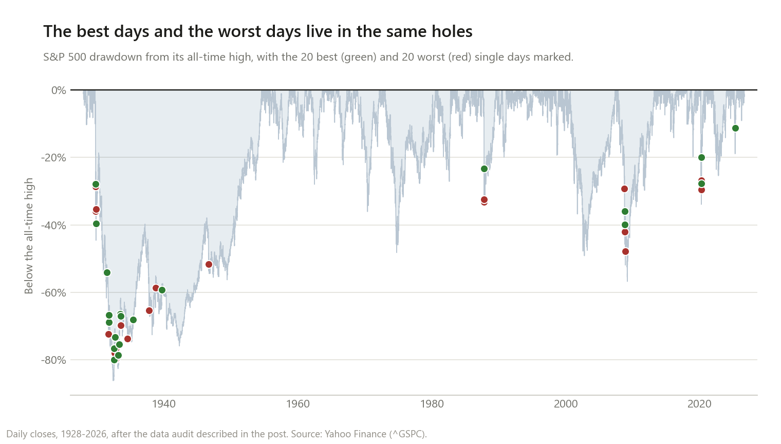
The top six single days in the long record: 15 March 1933 (+16.61%, with the market 78.6% below its high), 30 October 1929, 6 October 1931, 5 September 1939, 21 September 1932, and 13 October 2008. Every one of them landed in a catastrophe.
This is why “miss the 10 best days” is not a counterfactual anyone can actually run. To miss them you have to be out of the market. The reason people are out of the market is that they were just handed one of the ten worst days. The best days are not randomly distributed with respect to your decision to sell — they are conditional on it.
What a rule you can actually run does
The counterfactual is unrunnable, so I ran a real rule instead: hold the index while it is above its 200-day moving average, otherwise sit in Treasury bills. The signal comes from the previous close, so there is no hindsight in it.
| 200-day moving average, 1988–2026 | |
|---|---|
| Time in the market | 78.9% |
| Best days it sat out | 47 of 50 |
| Worst days it sat out | 43 of 50 |
| Buy and hold | 11.46% a year, worst drawdown −55.3% |
| The rule | 10.24% a year, worst drawdown −20.6% |
| Final wealth vs buy and hold | −34.2% |
It caught almost all of the worst days. It also caught almost all of the best days, because they are the same days. You do not get to keep one side.
The trade it actually offers is not “better returns” but 1.2 percentage points a year in exchange for cutting the worst drawdown from −55% to −21%. That is a real trade, and for some people a good one. It is just not the trade either side of this argument usually claims to be having.
Where this flips
In the 98-year price-only window, the same rule beat buy-and-hold by 80.7% — 6.85% a year against 6.20%, with the worst drawdown cut from −86.2% to −51.6%. I have to report that, but I do not believe it means what it looks like.
Price-only data excludes dividends, which were a far larger share of total return before 1990. That makes sitting in cash look free when it was not, and that single bias explains most of the gap. The rule also spent the 1929–1932 collapse outside the market, and an 86% drawdown is enough to dominate a century of results by itself. A strategy that wins on one biased dataset and loses on the unbiased one has not been validated.
What the chart actually proves
Not “you cannot time the market.” Something narrower and more useful:
You cannot be selectively absent. Absence is a package deal. The days that make the decade are bolted to the days that make you want to leave, and there is no version of history where you skip the crash and catch the rebound, because the rebound is the crash’s third act.
That is a genuinely good argument for staying invested. It is a much better argument than the chart makes, and it is the one the chart is quietly standing on. It just requires showing both tails to make it — which is exactly what the chart refuses to do.
Consistent with the other tests here: waiting for dips lost in 100% of rolling 20-year windows, and perfect foresight was worth only about 10–14%. Three different questions, same shape of answer — the timing decision matters far less than the participation decision.
The flip side is the one people actually lose sleep over: if the best days live inside drawdowns, how long do those drawdowns last? The median answer turns out to be far shorter than the averages everyone quotes.
Method notes and limitations
- The data audit changed my inputs, so it belongs here. This post is entirely about extreme single days, which means one bad price print lands directly in the answer. I screened for large moves reversed the next day that were also extreme outliers against the volatility of the surrounding weeks — a real crash sits inside a volatile stretch, a bad print does not. The 1988–2026 total-return series came back clean. The 98-year price series flagged three days: 16 April 1935, 16 August 1935, and 16 September 1936. All three are ±5–10% moves almost exactly undone the next session in otherwise quiet months. I treat them as bad data, not market history.
- Removing them changed nothing that matters. Missing the 10 best days stays at −66.9%; missing the 10 worst goes from +234.3% to +230.9%; missing both from +10.5% to +9.5%. The only visible effect is that 16 April 1935 drops out of the twenty worst days and 3 September 1946 takes its place. Every chart and clustering figure above uses the audited series.
- Days sat out earn 0% in the removal tables. Paying a cash rate on them would make “missing the worst days” look even better, so this choice works against my argument, not for it. The moving-average test does pay the T-bill rate, since there the cash yield is the whole point.
- No taxes, costs, or slippage. The moving-average rule traded on close prices with no friction. Real trading costs would make it worse; nothing here would make it better.
- The rule is one parameter on one market, and I did not search for a better one on purpose. A 150- or 250-day average would give different numbers, and picking the best of them after the fact is how backtests start lying.
- US large-cap only. Two windows, same market. I would not assume the clustering figures travel to markets with different crisis histories.
- Clustering is measured on the top and bottom 20 days. Widening to 50 loosens the gaps somewhat; the direction does not change.
This is research, not personalised financial advice.
The code
def grow(x, drop=None):
    """Total growth factor. Days listed in `drop` are sat out in cash at 0%."""
    y = x.copy()
    if drop is not None and len(drop):
        y[drop] = 0.0
    return float(np.prod(1.0 + y))


def top_idx(x, k, best=True):
    o = np.argsort(x)
    return o[-k:] if best else o[:k]


# the three columns: miss the best, miss the worst, miss both
b, w = top_idx(x, 10, True), top_idx(x, 10, False)
miss_best  = grow(x, b)
miss_worst = grow(x, w)
miss_both  = grow(x, np.concatenate([b, w]))

# how far below the all-time high was each of those days?
dd = (p / np.maximum.accumulate(p) - 1.0)[1:]
print(np.median(dd), np.median(dd[b]), np.median(dd[w]))
Data is ^SP500TR and ^GSPC daily closes from Yahoo Finance via yfinance, with
^IRX for the cash rate.
If you re-run it and get something different, I want to know.