What a Bad First Decade Does to Retirement
Every 4% rule failure came from the worst fifth of first-decade returns. The 2000 cohort's first decade was even worse than 1966's, and it hasn't failed.
The 4% rule post found that every historical failure came from one cohort, 1964–69, and that today’s valuation has only been exceeded once before — the CAPE peak of 1999–2000. The sequence-risk post proved that when the bad years land matters as much as how bad the 30-year total was, and that the first decade specifically carries most of that weight.
This asks the direct version of that question: across every real 30-year retirement start in the record — not reshuffled, the actual order and actual magnitude that actually happened — how much does the first decade predict the ending outcome? And it follows two real, named cohorts stride for stride: 1966, the one that failed, and 2000, the modern echo of today’s valuation. The twist is that 2000’s first decade was measurably worse than 1966’s. It has not failed.
Every failure came from the same fifth of history
Every one of the 840 real 30-year starts in the record, sorted by the market’s return over its first 10 years and split into fifths:
| First-decade return (of 840 real starts) | Failure rate | Median 30-year ending balance |
|---|---|---|
| Worst fifth (−7% to +79%) | 25.6% | 1.16× |
| 2nd fifth (+79% to +116%) | 0.0% | 2.88× |
| Middle fifth (+117% to +165%) | 0.0% | 4.36× |
| 4th fifth (+165% to +231%) | 0.0% | 5.31× |
| Best fifth (+231% to +374%) | 0.0% | 10.19× |
Every one of the 43 historical failures of the 4% rule sits in that top row. The other 672 real 30-year starts — 80% of the sample — have a perfect record, regardless of how the market performed over the following 20 years. Narrow the cut to the worst decile and the picture gets starker still:
| First-decade return (of 840 real starts) | Failure rate | Median 30-year ending balance |
|---|---|---|
| Worst 10% (+53.4% or worse) | 34.5% | 0.60× |
| Best 10% (+275.9% or better) | 0.0% | 10.43× |
The relationship is much stronger for how much money you end up with than for whether you run out at all: first-decade return correlates with the 30-year ending balance at +0.863, but only +0.294 with the binary survived-or-failed outcome — because failure is a threshold event concentrated in one tail of the distribution, not a smooth function of how the first ten years went.
A bad first decade is necessary. It is not sufficient.
| Median first-decade return | Count | |
|---|---|---|
| All 840 real starts | +142.2% | 840 |
| The 43 that failed | +52.0% | 43 |
| The 797 that survived | +148.9% | 797 |
Every one of the 43 failures had a below-median first decade — all 43, no exceptions. But flip that around: of the 420 real starts with a below-median first decade, only 43 actually failed. That is a 10.2% failure rate for “your first decade was worse than the historical median” — a real, elevated risk, but not close to a coin flip. A below-median first decade happens, by definition, to half of history, and most of the time it is still fine. It is the bottom fifth, not the bottom half, where the danger concentrates.
1966, the cohort that failed
The 4% rule post already found this: a retiree who started in February 1966 ran out of money in year 26 of 30. Here is where that failure sits on the scale above: a first-decade return of +51.1% — sounds unremarkable in isolation, but it is the 8th percentile of all 840 real starts, solidly inside the worst decile.
What makes 1966 a genuinely useful case, not just a nightmare edge case, is that the full 30 years compounded to +1565% (16.65×) — a strong 30-year return, as the sequence-risk post found when it reshuffled these exact 30 numbers and watched 96.5% of the reorderings survive. The market was fine, eventually. The first decade wasn’t, and by the time the market turned, there wasn’t enough principal left to fully benefit. One year before the money finally ran out, the account had already shrunk to 11.7% of its starting balance.
2000: the modern echo, with an even worse first decade
The 4% rule post flagged that today’s CAPE (35.2) has only been exceeded once in the historical record — the dot-com peak. Shiller’s CAPE hit its actual high within that window, 44.2, in December 1999. A retiree starting there earned +40.9% over the following ten years — the 6th percentile of the 840 real starts. One notch worse than 1966.
Twenty-six years of real data now exist for this cohort — the most this dataset can currently show. Tracing both cohorts’ account balance side by side, year by year:
| Years into retirement | 1966’s balance | 2000’s balance |
|---|---|---|
| 5 | 98.6% | 90.5% |
| 10 | 88.5% | 84.5% |
| 13 | 81.9% | 93.3% |
| 15 | 82.8% | 108.8% |
| 20 | 73.6% | 120.4% |
| 24 | 40.5% | 120.8% |
| 25 | 26.5% | 140.2% |
| 26 | 11.7% | 144.0% |
For the first ten years, 2000 tracks slightly behind 1966 — both losing ground relative to where they started, both inside the danger zone the tables above describe. Then, somewhere between year 10 and year 13, they split. 2000 turns and starts climbing. 1966 keeps falling.
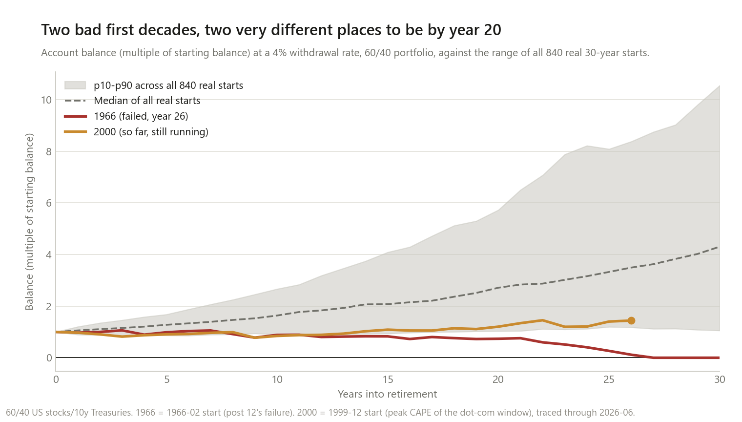
By year 26, 1966 was down to 11.7% of its starting balance, one year from the failure the 4% rule post already documented. 2000 sits at 144.0% — up, not down — after bottoming around 72.4% of its starting balance at its worst point.
I want to be careful about what this does and does not show. It is not a prediction that 2000 is safe: four years remain before its 30-year window even closes, and this site does not forecast what those years will bring. It is a data point, fully resolved as far as the record allows: an even worse first decade than the one historical failure on record, and — so far — a completely different outcome.
Why they split where they did
Both retirements started in the danger zone this post quantifies above, and for roughly a decade they moved together. 1966 plus thirteen years lands in 1979, heading into a stretch that hurt stocks and bonds at the same time as rates rose. 2000 plus thirteen years lands in 2013, deep into one of the strongest bull markets in the sample. The sequence-risk post is the one that isolates this mechanism directly — holding one fixed 30-year return sequence still and only reshuffling which years come first — and finds that which decade gets the good years, not just whether the first one was bad, is what decides the outcome. This post can’t isolate that the way that one does, because 1966 and 2000 are two different real 30-year sequences, not reshuffles of the same one. What it can say is narrower: two cohorts that looked equally alarming by year 10 ended up on opposite sides of solvent, and the split happened well into the second decade, not the first.
What this does and doesn’t change
It does mean a bad first decade is the sharpest real warning sign in this dataset. Every historical failure of the 4% rule came from the worst fifth of first-decade returns, and none came from anywhere else.
It does not mean a bad first decade is a verdict. Three-quarters of the worst-decile starts still made it the full 30 years, and the 2000 cohort — a first decade measurably worse than the only historical failure on record — is, so far, thriving.
It does mean the warning sign shows up years before the outcome does. By year 10, 1966 and 2000 already looked similarly risky — and so did hundreds of the 797 real starts that went on to survive comfortably. A bad first decade narrows the field. It doesn’t call the outcome.
These are fee-free numbers, like the rest of this cluster. A separate post quantifies what a real fee does to retirement math: layered on top of the numbers here, a 1% fee would pull every ending balance down and push every close call nearer the failure line.
Method notes and limitations
- “First-decade return” is the market’s, not the account’s — the blended 60/40 return for years 1–10 before any withdrawal comes out, the same definition the sequence-risk post used. Comparing it to what a withdrawing account did next is not circular.
- 840 overlapping windows, not 840 independent trials. As established in the 4% rule and sequence-risk posts, the underlying 100-year sample contains only about three independent 30-year eras. The quintile and decile splits above describe the realized record, not a large-sample statistical estimate.
- First-decade return correlates with the full 30-year return at +0.337 — positive but far from a full proxy relationship. Part of what looks like a “first decade” effect here is really “the whole 30 years was good or bad.” The sequence-risk post isolates the pure order effect by reshuffling one fixed 30-year return and finding order matters even holding the 30-year total completely fixed; this post measures the real, un-isolated relationship as it actually occurred.
- The 2000 cohort is incomplete — 26 of 30 years, through the same June 2026 cutoff as the rest of this dataset. Nothing here forecasts the remaining four.
- The December 1999 CAPE peak is the maximum within a 1998–2001 window, not a claim about the single highest valuation reading in unrestricted history.
- No fees, taxes, Social Security, or spending flexibility, as in the rest of this cluster.
This is research, not personalised financial advice.
The code
The first-decade metric, computed across all 840 real windows at once:
def decade_factors(S, B, years=30, weight_stock=0.60):
    """Per-window, per-year blended 60/40 growth factor -- before any withdrawal."""
    n = S.shape[0]
    Sy, By = S.reshape(n, years, 12), B.reshape(n, years, 12)
    return weight_stock * np.prod(1 + Sy, axis=2) + (1 - weight_stock) * np.prod(1 + By, axis=2)


factors = decade_factors(S_hist, B_hist)          # (840, 30)
decade1 = np.prod(factors[:, :10], axis=1) - 1     # first 10 years only

# trace one real cohort's actual year-by-year balance, not just its ending state
res = simulate(S_hist, B_hist, I_hist, 0.60, swr=0.04, return_path=True)
path_1966 = res["path"][list(starts).index(pd.Period("1966-02", "M"))]   # (31,) -- year 0..30
return_path is new in this post — the same withdrawal engine from the 4% rule
post, now able to return the full year-by-year balance
instead of only the final outcome, which is what tracing 2000 as a partial, still-unfolding
cohort required.
Data: the same Ken French / constructed-Treasury / FRED CPI series validated in the 60/40 post, plus Shiller’s CAPE for locating the 1999–2000 valuation peak, as used in the 4% rule post.
If you trace a different pair of real cohorts and the split doesn’t land somewhere in the 10–15 year range, I want to know what’s different about the pair you picked.