Does Asset Allocation Really Explain 90% of Your Returns?
The 90% figure is real but answers a question nobody is asking — and it isn't a constant: on the same 17 funds it was 85% in one era and 93% in the next.
“Asset allocation explains over 90% of your returns” is one of the most repeated numbers in personal finance, and it almost always arrives attached to a conclusion: so the specific funds you pick barely matter, just get the stock/bond split right.
The number is real. It comes from Brinson, Hood and Beebower’s 1986 study of 91 large US pension plans, which found that a plan’s policy allocation explained 93.6% of the variation in its quarterly returns over time. Ibbotson and Kaplan followed up in 2000 with a paper whose title is the whole problem in one line: “Does Asset Allocation Policy Explain 40, 90, or 100 Percent of Performance?” — three different answers, depending on which question you meant.
What I couldn’t find anywhere was that decomposition re-run on funds an ordinary investor can actually buy. So here it is, on 17 real allocation funds with 30 years of common history, split into the three questions people mix up.
The setup
Seventeen balanced/allocation funds that existed continuously from November 1995 to July 2026 — Vanguard’s LifeStrategy range, Wellington, Wellesley, Balanced Index and STAR, Fidelity Balanced and Puritan, American Balanced, T. Rowe Price Balanced and Capital Appreciation, Dodge & Cox Balanced, Oakmark Equity and Income, Berwyn Income, and BlackRock Global Allocation. Plus two pure index funds (VFINX, VBMFX) held aside as reference points.
Each fund’s “policy mix” is estimated from its own returns — a Sharpe-style fit of US stocks, 10-year Treasuries and cash, with weights constrained to be non-negative and sum to 1. Same stock and bond series as the 60/40 post and the retirement cluster, so the numbers stay comparable across this site. The estimated mixes run from 27% stocks (LifeStrategy Income) to 80% (LifeStrategy Growth).
Q1: Brinson’s actual question — one fund, over time
How much of a single fund’s month-to-month bouncing around is explained by its own policy mix?
| Balanced funds (N=17) | |
|---|---|
| Median R² | 88.6% |
| Range | 53.6% (Berwyn Income) to 99.4% (Vanguard Balanced Index) |
| Share clearing the quoted 90% | 41% (7 of 17) |
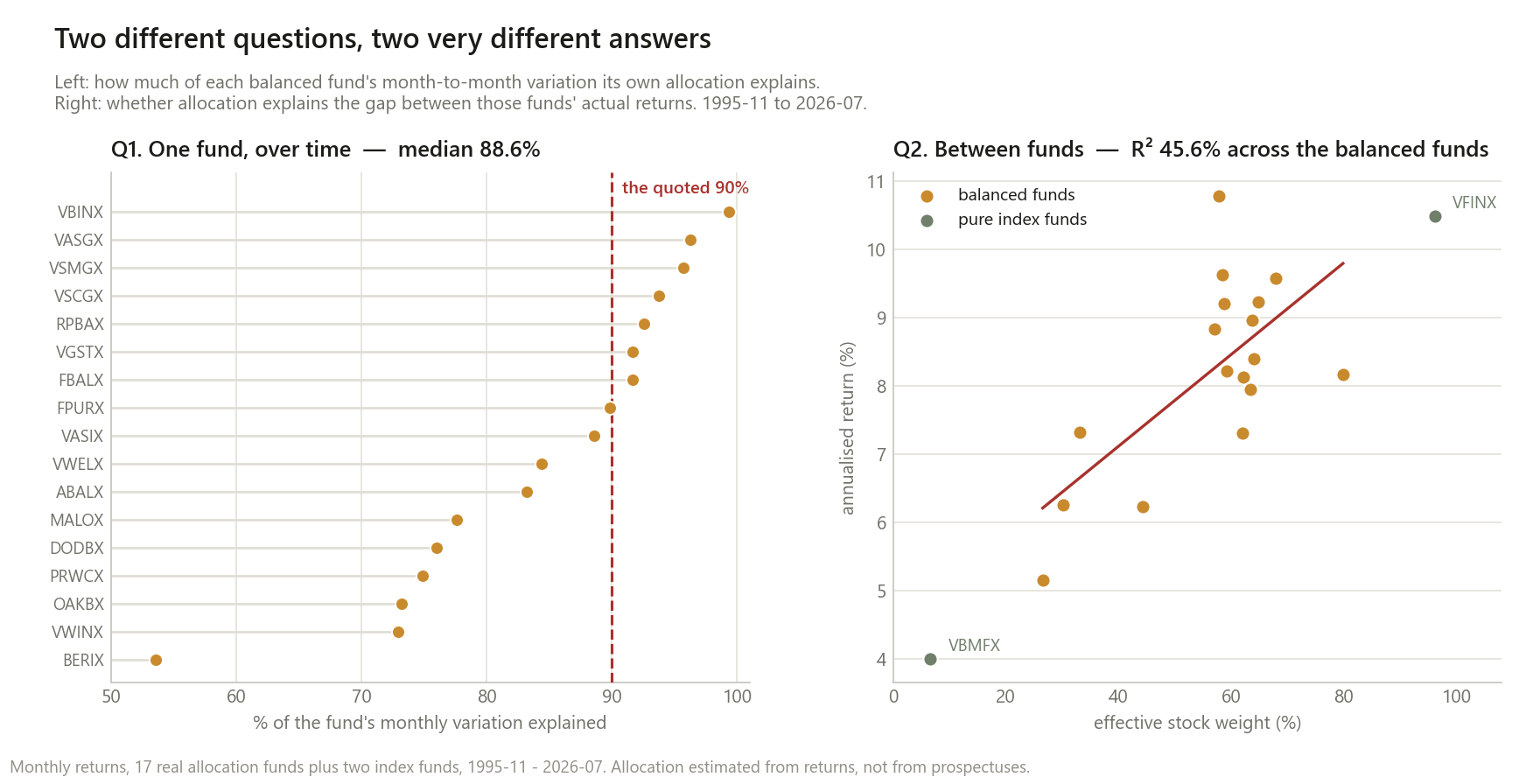
So on real retail funds the famous number lands a little below its billing — the median fund is at 88.6%, and well under half clear 90%. That’s a mild result on its own. The interesting part is what happens when you ask how that number is produced.
One check first, since this whole post rests on estimated policy mixes. Vanguard Balanced Index is the one fund here that genuinely is a plain US stock/bond mix, with no international sleeve and no manager discretion. If the method works, it should score near-perfectly. It does: R² 99.4%, tracking error 0.78%/yr, and a gap versus its own estimated policy mix of −0.03pp/yr. When the answer is known, the method finds it.
The 90% is mostly a statement about how little these funds deviate
Take a fixed 60/40 mix and add deliberate active deviation on top of it — a manager who bets against their own policy. How much betting does it take to push R² below 90%?
| Tracking error vs. the policy mix | R² |
|---|---|
| 0%/yr | 100.0% |
| 1%/yr | 99.0% |
| 2%/yr | 96.0% |
| 3%/yr | 90.2% |
| 5%/yr | 79.4% |
| 8%/yr | 58.8% |
| 20%/yr | 23.9% |
The real funds’ median tracking error is 3.33%/yr, and the most adventurous of them (Dodge & Cox Balanced) only reaches 5.69%. Read those two tables together: the simulation says 3%/yr tracking error lands you at 90.2%, and the real funds averaging 3.33% land at 88.6%. The headline statistic is very nearly a restatement of the fact that balanced funds stay close to their advertised mix. It is not independent evidence that allocation is the decision that matters — a fund would have to be wildly unlike its own stated strategy to score badly on it.
Two robustness checks, one of which changes the story
Is three asset classes too crude a definition of “allocation”? Several of these funds hold international equity and corporate credit, which a US-stock/Treasury/cash basis simply cannot see — so their “active” share is overstated by construction. Adding international equity and corporate bonds to the basis:
| Policy basis | Median R² | Share above 90% |
|---|---|---|
| 3 asset classes (US stock / Treasury / cash) | 88.6% | 41% |
| 5 asset classes (+ international, corporate bonds) | 91.2% | 53% |
BlackRock Global Allocation goes from 77.7% to 88.2% once the fit is allowed to see the 36% international weight it actually holds. Berwyn Income goes from 54.1% to 64.2% with a 22% credit weight. (This check runs on 362 months rather than 368, because the international fund used for the wider basis only starts in May 1996 — which is why Berwyn reads 54.1% here and 53.6% in the table above. Same fund, six fewer months.) Note that more asset classes can only fit at least as well, so treat 91.2% as an upper bound rather than an independent confirmation — but it does mean the sub-90% result in Q1 is partly my basis being too narrow, not managers going rogue.
Are the reverse-engineered weights flattering the fit? Brinson used each plan’s stated policy weights. Mine are fitted to the same returns they then explain, which should inflate R². Refitting on the first half and scoring only on the second:
| Median R² | |
|---|---|
| First half (1995–2011), weights fitted in-sample | 85.27% |
| Second half (2011–2026), weights from the first half | 93.12% |
| Second half, weights fitted in-sample | 93.37% |
This came out the opposite of how I expected. Fitting the weights out-of-sample costs 0.25 percentage points — essentially nothing. But the two halves of the sample differ by 8.10 percentage points on the same 17 funds. The number people quote as a constant of nature was 85% in one era and 93% in the next.
My first guess at why was that markets moved together more after 2011, so any fixed mix would explain more. The data says that’s wrong:
| 1995–2011 | 2011–2026 | |
|---|---|---|
| Median policy-mix volatility | 9.41%/yr | 9.40%/yr |
| Median fund tracking error | 4.02%/yr | 2.48%/yr |
The policy mixes were exactly as volatile in both halves. What changed is the funds: they deviated from their own allocations 38% less in the second half than the first. And that ties the whole post together, because the tracking-error simulation above was built independently of this split — feed it these two numbers and it predicts 84.7% for a 4.02% deviation and 93.2% for a 2.48% one. The measured values are 85.27% and 93.37%.
So the rise in “how much allocation explains” over the last 30 years is not a fact about markets. It’s a fact about the fund industry drifting toward staying closer to its own benchmarks.
Q2: the question people think they’re asking — differences between funds
If allocation explains 90% of returns, surely it explains most of why one fund beat another?
| Sample | Stock-weight range | R² |
|---|---|---|
| The 17 balanced funds only | 27%–80% | 45.6% |
| Plus a pure stock and a pure bond index fund | 7%–96% | 66.7% |
45.6% on balanced funds — close to the ~40% Ibbotson and Kaplan reported for mutual funds, which is a reassuring independent landing. But look at the second row: the same statistic on the same funds jumps 21 points purely because I widened the sample to include two funds that are more different from the others. That’s how cross-sectional R² works — it measures how much of the spread in a particular group is traceable to allocation, so it rises as the group’s allocations get more spread out. Quoted without its sample, the number means nothing at all.
The number that actually answers the investor’s question
Ordinary investors asking this aren’t choosing between a bond index fund and an S&P 500 fund. They’re choosing among funds that all look roughly the same. So: take only the 12 funds whose estimated stock weight sits between 50% and 75% — everything an adviser would call “a 60/40 fund” — and look at the spread.
| Annualised | $10,000 grew to | |
|---|---|---|
| Best (T. Rowe Price Capital Appreciation) | 10.79% | $231,375 |
| Worst (Vanguard LifeStrategy Moderate) | 7.31% | $87,033 |
| Spread | 3.48pp/yr | +166% |
Over 30.7 years, picking within one allocation band was worth a 166% difference in final wealth. The obvious objection is that T. Rowe Price Capital Appreciation is a famous star fund, so drop it: the next-best (Oakmark Equity and Income, 9.62%/yr) still leaves a 2.31pp/yr spread and $167,415 vs $87,033. Even the interquartile spread of the 12 funds — ignoring both tails entirely — is 1.12pp/yr, which is wider than the 0.97pp gap between a low-cost index fund and a typical 1% advisor fee, a gap this site has already shown compounds into six figures.
“Allocation explains 90%” and “which fund you choose was worth 166%” are both true, about the same funds, over the same 30 years. They are answers to different questions.
Q3: the level of return — the one I can’t answer cleanly
The third version asks how much of the level of a fund’s return the policy mix delivered. Median across the 17: the policy mix accounted for 90.8% of the fund’s return, with a median gap of +0.82pp/yr in the funds’ favour, and 11 of 17 beating their own estimated mix.
I don’t believe that number, and I’d rather say so than present it. Two problems:
- Survivorship. These are funds that existed in 1995 and still exist in 2026. Funds that performed badly enough to be closed or merged away are, by construction, missing. That biases the gap upward and I have no clean way to correct it here.
- Basis contamination, in both directions. The six funds that lagged their policy mix are mostly the Vanguard LifeStrategy funds — which hold large deliberate international allocations that a US-only basis scores as failed active management rather than as a different policy. The LifeStrategy Growth fund’s −1.18pp/yr “shortfall” is mostly international equity trailing US equity for 30 years, which is an allocation outcome, not a manager outcome.
Q1 and Q2 survive those problems because they’re about variation and relative ranking. Q3 is a statement about the level of return, and the level is exactly what both biases hit.
What this does and doesn’t change
It does mean the 90% statistic is real but nearly mechanical. It measures that balanced funds stay near their advertised mix while markets move a lot. A 3%/yr tracking error — roughly what these funds actually run — puts you at 90% on its own.
It does not mean the number is a constant. The same 17 funds gave 85.3% and 93.4% in consecutive 15-year halves, and the cause was measurable: their tracking error fell from 4.02% to 2.48%/yr while policy volatility held flat. Anyone quoting one decimal place of this as a law of investing is quoting the fund industry’s recent behaviour.
It does not mean fund choice doesn’t matter. Among funds in the same allocation band, 30 years of compounding turned a 3.48pp/yr spread into a 166% wealth difference — and 2.31pp even after dropping the star performer.
It does mean cross-sectional versions of this statistic need their sample quoted. 45.6% across balanced funds, 66.7% across a wider group, same data. The statistic is a property of the group being compared, not of investing.
Method notes and limitations
- Policy weights are estimated from returns, not read from prospectuses. This is returns-based style analysis, not Brinson’s design — he had the plans’ actual stated policy weights. The out-of-sample check above suggests the estimation isn’t what drives the result, but it is a real difference from the original study.
- Brinson studied pension plans, 1974–1983, quarterly. This studies retail mutual funds, 1995–2026, monthly. Different sample, different era, same decomposition. A difference in result is not evidence that either is wrong.
- Survivorship bias is present and uncorrected, as described in Q3. It affects the level comparisons most and the R² comparisons least.
- The three-asset basis is too narrow for the globally-diversified funds, quantified in the 5-asset robustness check rather than left as a caveat.
- October 2025 is missing from every series. CPIAUCNS has no observation for that month, so the shared data loader this site uses across posts drops it; all 19 funds and all policy mixes are compounded over the identical 368 months, so nothing is compared across different calendars.
- Returns are net of each fund’s expense ratio (that’s what fund NAV returns are) but the policy mixes are gross of any cost, so the “gap” figures understate manager contribution by roughly one expense ratio.
- No taxes. Several of these funds are tax-inefficient in ways this site has measured elsewhere.
This is research, not personalised financial advice.
The code
The whole argument is that one statistic is three statistics. Here is the difference, in eight lines:
# Q1: one fund's variation over time, explained by its own mix
r2_time = sm.OLS(fund, sm.add_constant(policy_mix_return)).fit().rsquared   # -> median 88.6%

# Q2: differences BETWEEN funds, explained by their mixes
r2_cross = sm.OLS(annual_returns, sm.add_constant(stock_weights)).fit().rsquared
#   balanced funds only            -> 45.6%
#   plus two pure index funds      -> 66.7%   (same statistic, wider sample)
Data: Ken French’s market series and the constructed 10-year Treasury total return used across this site, plus real monthly returns for 19 funds from yfinance, November 1995 to July 2026.
The era split is the result I’d most like someone to break. The claim it rests on is that these funds’ tracking error fell by roughly 40% between the two halves, and that this — not markets moving together — is what lifted the famous statistic by 8 points. If you run it on a different universe (European balanced funds, target-date funds, anything with a different survivorship profile) and find flat tracking error with the R² still rising, the mechanism I’ve described is wrong and I’d want to know.