How Many Stocks Do You Actually Need?
The famous answer is 20 to 30, and it comes from a volatility curve. That curve is real. It also answers a different question from the one you are asking.
Search this question and you land on academic PDFs. Evans and Archer said ten in 1968. Statman said thirty in 1987. Later papers say fifty, or three hundred. The number most people end up repeating is 20 to 30.
Almost all of those papers are answering the same question in the same way: plot portfolio volatility against the number of holdings, find where the curve flattens, call that enough.
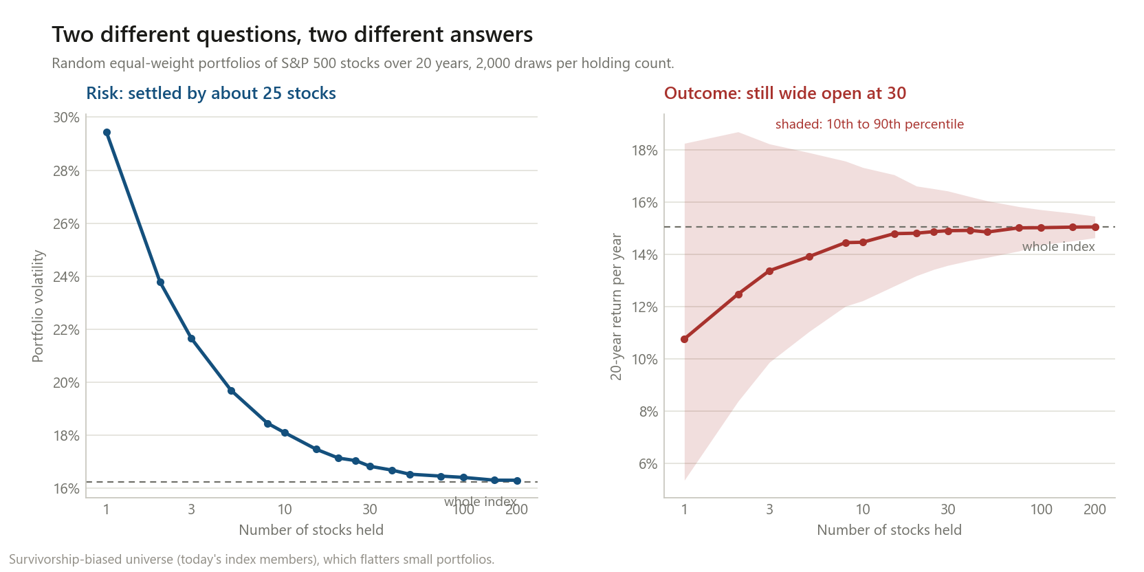
I reproduced that curve on 388 S&P 500 stocks with complete twenty-year histories. It is real, and the flattening happens right where they said it does. Then I plotted the thing you actually care about on the same portfolios, and it does not flatten in the same place.
The curve everyone quotes
2,000 random equal-weight portfolios at each size, monthly rebalanced, October 2005 to August 2026.
| Stocks held | Volatility | Share of the excess risk removed |
|---|---|---|
| 1 | 29.45% | — |
| 10 | 18.09% | 86.0% |
| 20 | 17.14% | 93.2% |
| 25 | 17.04% | 93.9% |
| 30 | 16.83% | 95.6% |
| 100 | 16.41% | 98.7% |
| 200 | 16.30% | 99.6% |
| All 388 | 16.24% | 100% |
The textbook answer checks out. By 25 stocks you have removed 93.9% of the volatility that a concentrated portfolio carries over the index. Going from 25 to 200 buys you another 5.7 percentage points of that gap — a rounding error on the axis.
If your question is “how many stocks until my portfolio stops lurching around more than the market”, the answer really is about 25.
The question that actually matters
Volatility is how much your portfolio wobbles on the way. It is not where you end up. Those are different, and for a right-skewed asset they are very different.
Here is the same set of random portfolios, scored on the outcome instead: $10,000 held for twenty years.
| Stocks held | 10th percentile | Median | 90th percentile | Spread |
|---|---|---|---|---|
| 10 | $100,494 | $149,222 | $244,625 | 2.43× |
| 20 | $119,131 | $158,540 | $216,567 | 1.82× |
| 30 | $127,749 | $161,193 | $209,654 | 1.64× |
| 50 | $134,836 | $159,782 | $196,458 | 1.46× |
| 100 | $146,704 | $164,462 | $185,271 | 1.26× |
| 200 | $153,771 | $165,304 | $177,494 | 1.15× |
| The index | $165,458 | — |
At thirty stocks — where the volatility curve says you are 95.6% done — the same $10,000 lands anywhere between $128,000 and $210,000. That is a 1.64× spread in final wealth, and it is not risk in the sense the volatility chart measures. It is the difference between which thirty names you happened to pick.
You have to get past a hundred holdings before that range narrows to something I would call converged.
One thing I got wrong before running this. I expected the median outcome to lag the index well beyond 30 stocks. It does not — the median 30-stock portfolio returns 14.91% against the index’s 15.06%, a shortfall of 0.15 points. The median converges roughly as fast as volatility does. What stays stubbornly wide is the dispersion, and that is the finding, not the one I went looking for.
There is one number that never converges, though:
| Stocks held | Portfolios that beat the index |
|---|---|
| 1 | 21.4% |
| 10 | 38.2% |
| 30 | 44.8% |
| 100 | 47.9% |
| 200 | 49.2% |
Fewer than half of random portfolios beat the index at any size. Not because of fees — there are none here — but because the index return is pulled up by a handful of extreme winners, and any given portfolio is more likely than not to miss them.
Why: the distribution is not symmetric
| Individual stocks that beat the index | 21.6% |
| Median single stock | 10.77%/yr |
| The index | 15.06%/yr |
| Mean single stock | 11.46%/yr |
| Best 10 stocks, average | +28.69%/yr |
| Worst 10 stocks, average | −1.34%/yr |
Only about one stock in five beat the index over twenty years. The median stock lost to it by 4.29 points a year. The mean sits above the median, which is the signature of right skew: a few enormous winners drag the average up past the typical case.
This is what a small portfolio is really exposed to. Not volatility — the chance of missing the 20%.
The number I found most useful: effective bets
Thirty correlated stocks are not thirty bets. You can measure how many independent bets a portfolio really contains from the eigenvalues of its correlation matrix — if every holding moved independently the measure returns the number you hold; if they all moved identically it returns 1.
| Stocks held | Effective independent bets | As a share |
|---|---|---|
| 5 | 3.52 | 70.4% |
| 10 | 5.10 | 51.0% |
| 30 | 7.25 | 24.2% |
| 50 | 8.02 | 16.0% |
| 100 | 8.50 | 8.5% |
| 200 | 8.85 | 4.4% |
| All 388 | 9.01 | 2.3% |
The entire large-cap US market is worth about nine independent bets.
Owning 388 stocks instead of 30 takes you from 7.25 effective bets to 9.01. You added 358 names and bought 1.76 more units of actual diversification, because US large caps are mostly one trade wearing 500 costumes. This is also why the volatility curve flattens — it is not that further stocks are redundant in a bookkeeping sense, it is that they are the same underlying exposure.
It also reframes the whole question. Diversifying within US large caps saturates around nine bets no matter what you do. If you want more than that, more names is not the lever; different exposures are — which is the same conclusion I reached from a different direction when dividend screens turned out to be value screens in disguise.
Where the tidy answer breaks
The standard advice that follows from all this is “spread across sectors”. I tested it and it is not reliably true.
| 30 stocks drawn from | Volatility | Return | Effective bets |
|---|---|---|---|
| Health Care only | 15.87% | 15.07% | 7.47 |
| Financials only | 19.59% | 11.85% | 4.20 |
| Industrials only | 19.45% | 15.96% | 4.08 |
| Information Technology only | 22.09% | 19.58% | 5.52 |
| Consumer Discretionary only | 22.04% | 16.66% | 5.59 |
| 30 spread across all sectors | 16.68% | 14.38% | 7.64 |
Thirty health care stocks had lower volatility than thirty stocks spread across every sector, and almost the same number of effective bets — because “health care” contains pharma, biotech, devices, insurers and distributors, which genuinely do different things. Thirty industrials gave 4.08 effective bets, barely half as many, because they are all the same cyclical trade.
So the rule is not “spread across sectors”. It is spread across things that behave differently, and sector labels are a rough and sometimes wrong proxy for that.
(The IT column, at 19.58% a year, is a reminder that concentration pays enormously when you concentrate correctly. That is hindsight, not a strategy.)
What I would take from this
- If you hold individual stocks, 25–30 is a reasonable floor, not a target. It buys you the volatility benefit almost entirely, and leaves a 1.64× spread in twenty-year outcomes that you should know you are accepting.
- A total-market index fund is not “30 stocks but tidier”. The gap between 30 names and the whole index is small in the median and large in the tails, and the tails are the part you cannot plan around.
- Effective bets is the better mental model than count. Nine is the ceiling in this universe. Ask what a new holding actually adds, not whether it makes the list longer.
- The honest reason to index is not lower volatility. It is that fewer than half of portfolios beat the index at any holding count, and you cannot tell in advance which half you are in.
Method notes and limitations
- Survivorship bias, and it runs against my conclusion. This uses today’s S&P 500 members, so every company that failed, was acquired at a loss, or dropped out is absent. Real small portfolios could have held those. This makes concentrated portfolios look better here than they were, so the true dispersion is wider than the tables show.
- Only 388 of 503 current members had complete 20-year histories. The excluded 115 are mostly companies that listed more recently, which skews the universe older and larger.
- Twenty years, one market, one regime. This window contains the financial crisis and a long large-cap growth boom. The effective-bets figure in particular would differ in a period when correlations were lower.
- Equal-weight, monthly rebalanced. The benchmark is an equal-weight portfolio of all 388, not the cap-weighted S&P 500, so that the comparison against equal-weight random portfolios is like for like. Cap weighting would give different numbers.
- The single-stock figures in the skew table are buy-and-hold while the benchmark rebalances monthly. Part of that 4.29-point median gap is a rebalancing effect rather than pure skew. The direction is not in doubt; the exact size is somewhat overstated.
- No taxes, costs, or the practical difficulty of running 30 positions. Those all argue further in favour of a fund.
- Effective bets uses the full-period correlation matrix, which averages over calm and crisis. Correlations rise in crashes, so the effective count is lower than 9 exactly when you need it to be higher.
This is research, not personalised financial advice.
The code
def effective_n(R):
    """Effective number of independent bets, from the correlation eigenvalues.

    N_eff = (sum L)^2 / sum L^2. Returns N if holdings were independent,
    1 if they all moved identically.
    """
    C = np.corrcoef(R, rowvar=False)
    lam = np.linalg.eigvalsh(C)
    lam = lam[lam > 0]
    return lam.sum() ** 2 / (lam ** 2).sum()


# volatility converges; the outcome distribution does not
for N in SIZES:
    draws = [port_stats(R, RNG.choice(K, size=N, replace=False)) for _ in range(2000)]
    vols, cagrs = zip(*draws)
    print(N, f"vol {np.mean(vols):.2%}",
          f"p10 {np.percentile(cagrs,10):.2%}", f"p90 {np.percentile(cagrs,90):.2%}")
Constituents come from Wikipedia’s S&P 500 list; monthly total returns are from Yahoo
Finance via yfinance.
If you re-run it and get something different, I want to know.