Your Portfolio Is Less Diversified Than You Think
Correlations did not spike in a crisis. Something worse was true: eleven asset classes were only ever worth about three and a half independent bets.
“Correlations go to 1 in a crisis” is one of the most repeated lines in investing. I set out to measure it on a normal diversified portfolio — eleven asset classes, daily data from 2007 so that 2008 sits inside the sample — expecting to confirm it.
It failed the test. The average pairwise correlation across those eleven assets in the worst 10% of market days was 0.247, against 0.268 on calm days. It went down.
The reason it went down turns out to be more damaging than the cliché.
Why the cliché fails here
Averaging correlations across a mixed portfolio hides two opposite movements. In a selloff, risk assets converge — and Treasuries and gold go more negative. Those cancel in the average, so the average tells you nothing.
Look at the assets individually and the picture is sharp:
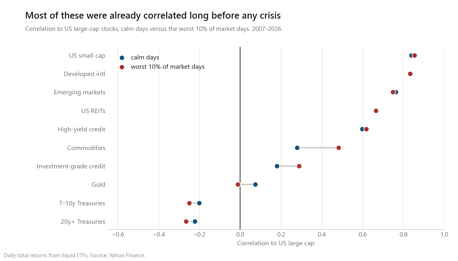
| Asset | Calm | Worst 10% of days | Change |
|---|---|---|---|
| US small cap | 0.838 | 0.855 | +0.017 |
| Developed international | 0.836 | 0.833 | −0.003 |
| Emerging markets | 0.763 | 0.748 | −0.014 |
| US REITs | 0.668 | 0.665 | −0.003 |
| High-yield credit | 0.597 | 0.619 | +0.021 |
| Commodities | 0.279 | 0.482 | +0.204 |
| Investment-grade credit | 0.180 | 0.288 | +0.109 |
| Gold | 0.074 | −0.012 | −0.086 |
| 7–10y Treasuries | −0.201 | −0.250 | −0.049 |
| 20y+ Treasuries | −0.222 | −0.265 | −0.043 |
Correlation to US large-cap stocks. Daily, 2007–2026, 488 stress days.
Two things stand out, and neither is the thing everyone warns about.
Only two holdings genuinely abandoned you. Commodities went from 0.279 to 0.482, and investment-grade credit from 0.180 to 0.288. Those are real crisis-correlation increases and they are worth knowing about.
Everything in the equity sleeve was already correlated. Small cap, developed international, emerging markets and REITs averaged 0.776 on calm days and 0.775 in stress. Identical. They did not fail during the crisis — they were never diversifiers to begin with. The crisis just made it visible.
That is the actual hidden risk. Not that diversification breaks under stress, but that a portfolio can look diversified on the statement and never have been.
Eleven assets, three and a half bets
The cleanest way to say it is with the same eigenvalue measure I used for individual stocks. It answers: how many genuinely independent bets does this collection contain?
| Effective independent bets (out of 11) | |
|---|---|
| Whole sample | 3.45 |
| Calm days | 3.96 |
| Worst 10% of days | 3.77 |
Eleven asset classes. About three and a half bets. And notice the last two rows: it falls by 5% under stress. Not a collapse — because there was not much there to collapse.
This is the number I would put on a statement if I could. You do not lose your diversification in a crisis; you find out how little you bought.
Worth noting the flip side of the earlier post: 388 individual US stocks were worth about nine effective bets, or 2.3% of the names held. Eleven asset classes are worth 3.45, or 31%. Asset classes are roughly thirteen times more efficient per holding than stocks are. Spreading across asset classes is the right instinct; it just does not go as far as the count suggests.
What the beta adjustment reveals
Raw correlation cannot distinguish two assets that move together because they both carry market exposure from two that share a second hidden driver. Stripping out each asset’s market component and correlating what is left separates them.
Average residual correlation is 0.155 in calm and 0.104 in stress — low, and it falls. So there is no broad second factor binding this portfolio together. But specific pairs light up:
| Pair | Residual correlation |
|---|---|
| 7–10y + 20y+ Treasuries | +0.902 |
| Investment-grade credit + 7–10y Treasuries | +0.669 |
| Investment-grade credit + 20y+ Treasuries | +0.653 |
| Developed international + Emerging markets | +0.554 |
| Investment-grade credit + High-yield credit | +0.432 |
| Gold + Commodities | +0.345 |
The first row is obvious — two Treasury funds are one duration bet.
The second and third are the useful ones. After removing the market, investment-grade credit is roughly 0.66 correlated with Treasuries. Holding LQD alongside IEF is not two positions; it is mostly one interest-rate bet with a credit sleeve attached. That is invisible in the raw numbers, where LQD’s correlation to stocks (0.180) makes it look like a genuine third thing.
The genuine diversifiers, by the same measure, are unglamorous: commodities against Treasuries (−0.131) and against REITs (−0.044). The only reliably negative residual relationships in the whole set involve the asset that behaved worst in the crisis.
What all that diversifying actually bought
Here is the part I did not expect to be so blunt. Equal-weight across all eleven asset classes, against plain 60/40 built from two of them:
| Return | Volatility | Worst drawdown | Average stress day | |
|---|---|---|---|---|
| Equal-weight, all 11 | 6.90% | 12.05% | −35.4% | −1.18% |
| Plain 60/40 (SPY + IEF) | 8.52% | 11.30% | −31.4% | −1.23% |
The eleven-asset portfolio lost on return, on volatility, and on drawdown. Its only advantage was five hundredths of a percent on the average stress day.
I want to be careful about how far that goes. This is one window, and it is a window in which US large-cap stocks were exceptional — any portfolio that diluted US equities was going to lose to one that concentrated in them, and that is a statement about 2007–2026 rather than about diversification. A different two decades would rank these differently.
But the drawdown column is harder to explain away. The whole promise of adding nine more asset classes is that the worst case gets better. It got four points worse.
What I would take from this
Count exposures, not line items. Adding small cap, international, emerging markets and REITs to a US equity portfolio adds line items. At 0.78 average correlation, it does not add much else.
Beware the assets that only look uncorrelated. Investment-grade credit has a low correlation to stocks and a 0.67 residual correlation to Treasuries. Its diversification is against the thing you already own most of.
The real diversifiers were the ones that looked useless. Treasuries and gold were the only holdings that improved under stress, and gold spends most decades being something you regret. That is not a coincidence: an asset that is comfortable to hold is usually one that moves with everything else.
Diversification failing in a crisis is mostly a story people tell to explain a portfolio that was concentrated all along. In this data the correlations barely moved. The concentration was there in the calm-day column, available to anyone who looked, for years before it mattered.
Method notes and limitations
- Stress is defined ex post as the worst 10% of days for US large caps. That is the cleanest definition of “when you needed the hedge”, but it is not a state you can identify in advance, and results would differ under a drawdown-based or volatility-based definition.
- Daily data. Correlations at a daily frequency differ from monthly ones — daily tends to pick up more common short-term liquidity effects. Monthly would likely show somewhat lower correlations for the credit and commodity holdings.
- One window, 2007–2026, containing one credit crisis, one pandemic, and one inflation shock. It also contains an exceptional run for US large caps, which flatters 60/40 in the final table for reasons that have nothing to do with correlation.
- ETFs, so returns are net of fees and include tracking differences. DBC in particular carries commodity futures roll costs that make it a poor proxy for spot commodities.
- Betas are estimated within each regime, so the residual correlations in the stress column use stress-period betas. Using full-sample betas instead raises residual correlation in stress somewhat, because betas themselves rise.
- Equal weight is a deliberately naive benchmark. A risk-parity or volatility-weighted version of the eleven-asset portfolio would look considerably better, particularly on drawdown. I used equal weight because it is what “diversified” usually means in practice.
- US-dollar investor, US-listed funds. Currency exposure in EFA and EEM is unhedged and is part of what those correlations measure.
This is research, not personalised financial advice.
The code
def residualise(df, mkt):
    """Strip each asset's market component; return the residuals.

    Whatever correlation survives this is a shared driver that is NOT
    the market -- which is the thing raw correlation cannot show you.
    """
    m = df[mkt].to_numpy(float)
    X = np.column_stack([np.ones_like(m), m])
    out = {}
    for c in df.columns:
        if c == mkt:
            continue
        y = df[c].to_numpy(float)
        coef, *_ = np.linalg.lstsq(X, y, rcond=None)
        out[c] = y - X @ coef
    return pd.DataFrame(out, index=df.index)


def effective_n(R):
    """How many independent bets are actually in here?"""
    lam = np.linalg.eigvalsh(np.corrcoef(R, rowvar=False))
    lam = lam[lam > 1e-10]
    return lam.sum() ** 2 / (lam ** 2).sum()      # -> 3.45 for 11 asset classes
Daily total returns for SPY, IWM, EFA, EEM, VNQ, LQD, HYG, IEF, TLT, GLD and DBC, from
Yahoo Finance via yfinance.
If you re-run it and get something different, I want to know.