Does Fibonacci Retracement Actually Work?
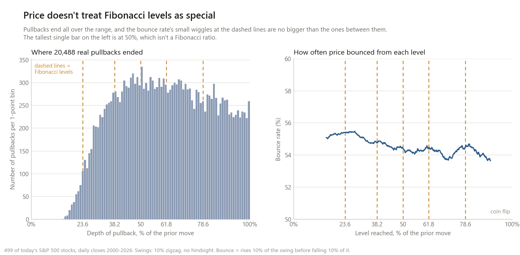
14.7 million times price reached a level in 499 stocks. It bounced off Fibonacci levels 54.86% of the time, and off the levels right next to them 54.79%.
The pitch goes like this. After a stock rallies, it pulls back, and the pullback tends to stop at 23.6%, 38.2%, 50%, 61.8% or 78.6% of the rally before the uptrend picks up again. Those ratios come from the Fibonacci sequence, and 61.8% is the “golden ratio”. Buy at the level, put your stop below the swing low, and you’re trading with the market’s hidden structure.
Most of what ranks for this question is a chart where price turned right at 61.8%. A chart like that can’t tell you anything, and here is the reason in one number: of the real stock pullbacks tested below, 36.2% ended within 3 points of some Fibonacci level. Five lines spread across the range will catch a lot of turning points no matter what drives them. The question isn’t whether price ever turns at 61.8%. It’s whether it turns there more often than at 58% or 65%, which nobody draws on their chart.
So that’s the test. I took every level from 15% to 90% in 0.2-point steps, 376 of them, and ran the same rules at each one. If Fibonacci levels matter, they have to beat the meaningless levels sitting right next to them.
How the test works
Swings are found by a fixed rule, with no hindsight. Choosing which low and which high to draw from is where Fibonacci charts quietly cheat: after the fact, there’s always a swing that makes the levels line up. Here a swing low only counts once price has already risen 10% above it (a standard zigzag filter). The grid is drawn from that confirmed low to the highest close since then, exactly what a trader would see on the day, and every new high redraws it.
A “touch” is the first close at or below a level for that particular low and high.
The five levels are the ones every Fibonacci tool draws: 23.6%, 38.2%, 50%, 61.8% and 78.6%. Strictly, 50% isn’t a Fibonacci ratio, but it’s on every retracement chart, so it’s tested as one.
A “bounce” means price then rose by 10% of the swing before it fell by 10% of the swing. The bracket is symmetric around the entry, so if levels don’t matter, this is a coin flip plus whatever upward drift the stock has. If a level acts as support, bounces should be more common there than anywhere else.
Data: daily closes for 499 of today’s S&P 500 stocks, 2000–2026. That’s 36,744 swings and 14.7 million level touches. I also ran the S&P 500 index back to 1928, EUR/USD, gold and bitcoin, because those are the markets where Fibonacci is most popular.
Result 1: price bounces off Fibonacci levels about as often as off the levels beside them
“At the level” means within 1 point of a Fibonacci level. “Next to it” means 2 to 5 points away, on either side.
| Stocks, 2000–2026 | Touches | Bounce rate at a Fibonacci level | Next to it | Difference | 95% interval |
|---|---|---|---|---|---|
| 10% swings, 5% bracket | 14,721,978 | 54.16% | 54.10% | +0.05 pt | −0.04 to +0.16 |
| 10% swings, 10% bracket | 14,714,984 | 54.86% | 54.79% | +0.07 pt | −0.01 to +0.16 |
| 20% swings, 5% bracket | 5,727,847 | 56.43% | 56.43% | +0.00 pt | −0.19 to +0.20 |
| 20% swings, 10% bracket | 5,720,129 | 57.26% | 57.22% | +0.04 pt | −0.10 to +0.19 |
The intervals come from resampling whole swings, since the touches within one swing aren’t independent. Every difference is under a tenth of a percentage point, and every interval stays within about a fifth of a point of zero. At 0.07 points, the headline difference works out to 7 extra bounces in every 10,000 touches.
Level by level, against the same statistic calculated at all 326 ordinary levels from 20% to 85%:
| Level | Bounce rate at it | Next to it | Difference | Rank among ordinary levels |
|---|---|---|---|---|
| 23.6% | 55.40% | 55.36% | +0.04 pt | 55th percentile |
| 38.2% | 54.82% | 54.75% | +0.07 pt | 63rd percentile |
| 50% | 54.39% | 54.33% | +0.06 pt | 58th percentile |
| 61.8% | 54.44% | 54.28% | +0.16 pt | 90th percentile |
| 78.6% | 54.48% | 54.36% | +0.12 pt | 76th percentile |
Ordinary levels range from −0.24 to +0.21 points between their 5th and 95th percentiles. The golden ratio does best of the five, and about one arbitrary level in ten does at least as well.
Being fair: is there a whisper of something?
All five Fibonacci levels came out slightly positive. That’s worth taking seriously rather than waving away: if you pick five random levels spaced at least 10 points apart, only 4% of those sets average as high a rank as the Fibonacci set does. So there may be a faint tendency, at the level of a tenth of a point.
Two things argue against making anything of it.
It’s too small to trade. A tenth of a point on a bounce rate is not an edge that survives a bid-ask spread. The 54–55% bounce rate itself isn’t coming from the levels either: it’s already 55.08% at the shallowest level tested (15%) and still 53.65% at the deepest (90%), because stocks drift upward and this sample is made of survivors.
It went the wrong way over time. The strongest argument for Fibonacci is that it’s self-fulfilling: enough traders watch the levels that orders pile up there. If so, it should have gotten stronger once every charting app started drawing the levels for free. Splitting the sample by when each swing started:
| Swings starting | At the level | Next to it | Difference | 95% interval |
|---|---|---|---|---|
| 2000–2012 | 54.80% | 54.69% | +0.11 pt | −0.00 to +0.22 |
| 2013–2026 | 54.93% | 54.90% | +0.03 pt | −0.10 to +0.16 |
Whatever faint effect there was in the 2000s mostly disappeared in the era when the levels became most popular.
The markets where Fibonacci is most popular
| Market | Swing size | Swings | At the level | Next to it | Difference | 95% interval |
|---|---|---|---|---|---|---|
| S&P 500 index, 1928–2026 | 5% | 340 | 53.07% | 53.24% | −0.17 pt | −1.05 to +0.67 |
| S&P 500 index, 1928–2026 | 10% | 104 | 59.18% | 60.55% | −1.36 pt | −3.02 to +0.44 |
| EUR/USD, 2003–2026 | 2% | 131 | 49.95% | 50.89% | −0.94 pt | −2.27 to +0.50 |
| EUR/USD, 2003–2026 | 4% | 38 | 47.00% | 48.50% | −1.50 pt | −4.20 to +0.84 |
| Gold futures, 2000–2026 | 5% | 89 | 59.08% | 60.39% | −1.31 pt | −2.81 to +0.34 |
| Gold futures, 2000–2026 | 10% | 27 | 59.89% | 59.85% | +0.04 pt | −3.10 to +3.14 |
| Bitcoin, 2014–2026 | 15% | 59 | 50.59% | 50.14% | +0.45 pt | −1.99 to +2.67 |
| Bitcoin, 2014–2026 | 30% | 17 | 57.49% | 58.60% | −1.11 pt | −4.69 to +2.59 |
A single market gives far fewer swings, so these intervals are wide. But six of the eight point estimates are negative, meaning price bounced slightly less at the Fibonacci level than next to it, and none of the eight rows is distinguishable from zero. Nothing here suggests forex, gold or crypto traders are seeing something the stock data missed.
Result 2: where pullbacks actually end
The left panel of the chart asks the question a different way: forget bounces, where do completed pullbacks actually stop? Across 36,245 completed 10% swings:
- 43.5% of pullbacks went past 100%: they erased the entire prior rally. A Fibonacci grid has nothing to say about those, and they’re close to half of all cases.
- Of the ones that stopped inside the move, 12.2% ended within 1 point of a Fibonacci level, 23.9% within 2 points, 36.2% within 3 points. 34.2% ended somewhere in the 38.2%–61.8% band.
- Compared with the 2–5 points on either side, 38.2% and 50% get slightly more pullbacks ending on them (+3.5% and +3.6%), while 23.6%, 61.8% and 78.6% get slightly fewer (−1.1%, −2.1%, −7.2%). All five sit inside the range that ordinary levels produce (5th–95th percentile: −9.5% to +7.8%).
The single tallest bar in the histogram is at 50%: 336 pullbacks ended between 50% and 51%, against 295 and 287 in the bars on either side (the typical bar between 30% and 90% holds 285). It’s the one thing on the chart that looks like a spike, and 50% isn’t a Fibonacci ratio. It’s a round number, and round numbers have their own literature. With 20% swings instead of 10%, 50% ranks at the 96th percentile of ordinary levels; with 10% swings, at the 75th. Suggestive, not solid, and not Fibonacci either way.
To be complete about the 20% swings: there are fewer of them (10,727), and there the endpoints lean a little toward the middle levels. 50% ranks at the 96th percentile and 61.8% at the 89th, and the tallest bar is 60%–61%, just shy of 61.8%. That’s the best case for Fibonacci anywhere in this analysis. It doesn’t carry over to what a trader actually does with the level, though: on those same 20% swings, price that reached a Fibonacci level bounced 57.26% of the time, against 57.22% next to it. If pullbacks stall there slightly more often, that doesn’t make a bounce afterwards any more likely.
Result 3: the “golden zone” trade
The most commonly taught version of the strategy: wait for a pullback into the 50%–61.8% “golden zone”, buy, put the stop below the swing low, and take profit at the swing high. Here’s that trade at a range of entry depths, Fibonacci and otherwise, on the same stocks and swings:
| Entry depth | Trades | Average return per trade | Average days held | Return per day held |
|---|---|---|---|---|
| 23.6% | 69,301 | +2.41% | 30 | +0.081% |
| 30% | 57,560 | +2.53% | 32 | +0.080% |
| 38.2% | 46,840 | +2.57% | 32 | +0.079% |
| 44% | 41,018 | +2.53% | 32 | +0.080% |
| 50% | 35,920 | +2.42% | 31 | +0.079% |
| 56% | 31,656 | +2.30% | 29 | +0.079% |
| 61.8% | 27,993 | +2.15% | 27 | +0.079% |
| 68% | 24,298 | +1.98% | 24 | +0.082% |
| 78.6% | 18,336 | +1.63% | 19 | +0.085% |
Return per day held is flat: between +0.078% and +0.088% at every entry depth from 15% to 90%, Fibonacci or not. Deeper entries make less per trade but get out sooner; shallower entries do the reverse. It all washes out to the same thing, which is what you’d expect if the levels are just points on a ruler.
The golden zone as a whole returned +2.30% per trade and +0.079% per day held. Slide the same 11.8-point-wide zone up or down and you get:
| Zone | Per trade | Per day held |
|---|---|---|
| 40%–51.8% | +2.49% | +0.079% |
| 45%–56.8% | +2.40% | +0.079% |
| 50%–61.8% (golden zone) | +2.30% | +0.079% |
| 55%–66.8% | +2.17% | +0.079% |
| 60%–71.8% | +2.03% | +0.080% |
The golden zone sits exactly where a smooth line through its neighbours would put it.
Don’t read the level of these returns as an edge. Every one of these stocks is in today’s S&P 500, which means every one of them is a stock whose dips eventually recovered. Buying pullbacks in a list of known survivors will look good at any depth. Only the comparison across depths means anything here, and across depths, there’s nothing. (Whether buying dips beats simply buying, for someone investing regularly, is its own question, and the answer is mostly no.)
This matches the academic work
This isn’t a new finding so much as a transparent, re-runnable version of one. Tsinaslanidis, Guijarro and Voukelatos (2022, Expert Systems with Applications 187, 115893) built an automatic Fibonacci-retracement detector and ran it on Dow Jones, NASDAQ-100 and DAX stocks from 1968 to 2019. They found prices were no more likely to bounce at Fibonacci levels than at non-Fibonacci levels, and that a trading rule built on Fibonacci levels didn’t beat one built on randomly chosen levels.
They also found that wider zones around each level catch more bounces, and trading performance stayed poor anyway. That’s the same trap as the 36.2% figure at the top of this post: make the target bigger and you hit it more often, which says nothing about the target.
Different stocks, a different period, a different swing rule, the same answer.
Why it feels like it works
- Five lines, close together. With a 3-point tolerance, the five levels cover a large share of the range, so 36.2% of pullbacks “respect a level” by construction. Traders who use zones instead of lines cover even more.
- The swing is chosen after the fact. Pick a slightly different low or high and every level moves. On a chart you’re looking at in hindsight, some choice nearly always lines up.
- Misses don’t get remembered. When price slices through 61.8%, the story becomes “watch 78.6%”, and after that, the swing low. Nearly half of pullbacks (43.5%) blow through all of them.
What this does and doesn’t change
It does mean Fibonacci levels carry no information that ordinary levels don’t. Across 14.7 million touches, price treated the golden ratio the way it treated 58% and 65%.
It does not mean traders who use Fibonacci all lose money. Their stops, position sizing and exits can still make or lose money. The levels themselves just don’t add anything: you’d get the same results drawing lines at 40%, 55% and 70%.
It does not mean support and resistance are imaginary. Prior highs and lows, round numbers and moving averages are separate claims that this post didn’t test. The 50% bump is a hint that round numbers might deserve a closer look.
Method notes and limitations
- Daily closes only. Many Fibonacci traders use 1-hour or 4-hour charts and intraday highs and lows. Nothing here tests intraday behaviour. Closes were used because pre-1962 index data has no reliable intraday highs and lows, and it avoids ambiguity when a bracket’s target and stop are both hit on the same day.
- One swing-detection rule, at a few sizes. A 10% or 20% zigzag for stocks, and two sizes chosen to suit each other market’s typical volatility. A different swing rule would produce different swings, but there’s no reason it would make Fibonacci levels special where these didn’t.
- Survivorship bias. Today’s S&P 500 members only. This inflates the returns in Result 3 and the bounce rates in general. It doesn’t affect the Fibonacci-versus-neighbour comparisons, which are made within the same stocks and the same swings.
- No transaction costs, taxes or slippage. None of them would change a comparison between levels, and all of them would swamp a difference of a tenth of a point.
- Extension levels (127.2%, 161.8%) weren’t tested, only retracements.
- Re-downloading moves the last digit. yfinance’s adjusted history shifts slightly between downloads (fresh downloads minutes apart differed by a few swings out of 36,000). The numbers here are from the run saved alongside the script; no conclusion changed between runs.
This is research, not personalised financial advice.
The code
The core of the test: draw the grid from a swing low confirmed without hindsight, and record the first touch of every level, Fibonacci or not.
for leg, (ai, conf) in enumerate(lows):           # conf = day the low was confirmed
    A, B = c[ai], c[ai:conf + 1].max()
    for t in range(conf + 1, end):
        if c[t] > B:                              # new high: redraw the grid
            B = c[t]; touched[:] = False; continue
        if c[t] < A:                              # 100% retraced: this swing is over
            break
        hit = ~touched & (GRID <= (B - c[t]) / (B - A))
        # ...score a +/- 10%-of-swing bracket from c[t] for every level in `hit`
Full script, including the placebo ranking and the golden-zone trade:
analysis/22_fibonacci_retracement.py. Data: yfinance daily closes (auto-adjusted), with today’s
S&P 500 constituents from Wikipedia, the same universe used in the diversification
post.
If you have a Fibonacci rule that does beat the levels next to it out of sample, on a swing rule fixed in advance, I’d like to see it. That’s the comparison that matters, and it’s the one the charts never show.