Dividend Growth vs High Yield: Which Actually Wins?
Dividend growth beat high yield by 0.78 points a year. Both lost to just buying the index. And the difference between them turns out to be one factor.
This argument has two entrenched sides. High-yield investors point at the income you get now. Dividend-growth investors say chasing yield lands you in yield traps — companies whose yield is high because the price already collapsed and the dividend is about to be cut.
Both sides mostly argue by assertion. So here are three tests: does more yield actually pay, do the real funds behave as advertised, and does the income really grow faster.
Test 1: is more yield better?
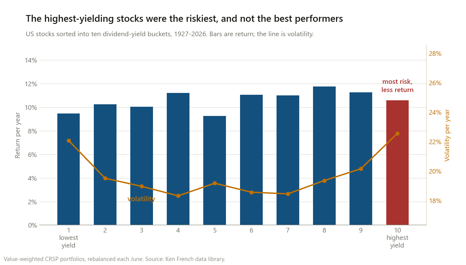
Every US stock, sorted into ten buckets by dividend yield each June, 1927–2026.
| Decile | Return | Volatility | Sharpe |
|---|---|---|---|
| 1 (lowest yield) | 9.48% | 22.08% | 0.38 |
| 4 | 11.23% | 18.32% | 0.50 |
| 8 | 11.76% | 19.36% | 0.50 |
| 9 | 11.28% | 20.16% | 0.47 |
| 10 (highest yield) | 10.61% | 22.56% | 0.41 |
| Pays nothing | 9.47% | 28.05% | 0.35 |
The relationship is not monotonic. Returns peak at the eighth decile, then fall 1.15 points by the tenth — while volatility jumps from 19.36% to 22.56%. The highest-yielding stocks took the most risk of any dividend payer and did not deliver the most return.
I want to be careful about how much weight that carries. The return column is genuinely noisy — decile 5 comes in at 9.28%, below decile 4 and decile 6, which is not a story, it is sampling variation. I would not defend “decile 8 is the optimum” as a finding.
What does replicate is the risk column. Volatility is a clean U: about 22% at both extremes, about 18.3% in the middle. The lowest-yield stocks and the highest-yield stocks are both the risky ends of the market — speculative non-payers at one end, distressed high-payers at the other. That is the yield-trap claim, and in the risk data it is real.
Test 2: the funds people actually buy
Deciles are abstractions. Here are the two funds this argument is usually conducted with, plus the option nobody in the argument is defending. Total return, 2006–2026, 237 months.
| Return/yr | Volatility | Sharpe | Worst drawdown | |
|---|---|---|---|---|
| VIG (dividend growth) | 10.22% | 13.41% | 0.67 | −41.1% |
| VYM (high yield) | 9.43% | 14.50% | 0.58 | −51.8% |
| SPY (just the index) | 10.99% | 15.37% | 0.66 | −50.8% |
Dividend growth beat high yield by 0.78 percentage points a year, with lower volatility and a drawdown ten points shallower. On the terms of the debate, dividend growth wins.
But look at the third row. Both of them lost to simply buying the S&P 500. The entire twenty-year argument was conducted between two options that each trailed the index the participants were trying to beat.
VIG’s defence is real and it is on the risk side: essentially the same Sharpe ratio as the index (0.67 vs 0.66) with a drawdown ten points shallower. That is a genuine risk-management result. It is not the “dividend growth compounds you to superior wealth” claim.
| Total return through | VIG | VYM | SPY |
|---|---|---|---|
| 2008 crisis | −40.9% | −51.6% | −50.8% |
| Covid crash | −16.7% | −24.0% | −19.4% |
| 2022 selloff | −20.2% | −13.5% | −23.9% |
VIG’s protection showed up in the two crashes that were about credit and panic. In 2022 — a rate-and-valuation selloff — it reversed completely, and the high-yield fund was the one that held up. Neither fund is defensively superior in general. They are exposed to different things.
Test 3: what are they actually made of
Running both through the five-factor model, the same way I did with the dividend portfolios themselves:
| Market | Size | Value | Profitability | Investment | |
|---|---|---|---|---|---|
| VIG (growth) | 0.85 | −0.08 | +0.00 | +0.21 | +0.21 |
| VYM (high yield) | 0.86 | −0.09 | +0.30 | +0.15 | +0.24 |
| SPY | 0.99 | −0.12 | +0.03 | +0.05 | +0.02 |
There it is. VIG has a value loading of exactly zero and a profitability tilt. VYM carries a +0.30 value loading. Both hold beta near 0.85, which is where the lower volatility comes from.
Netting them against each other makes it unmistakable:
| VIG minus VYM | Alpha/yr | t-stat |
|---|---|---|
| Raw difference | +0.78pp | — |
| Market only | +0.95% | 0.76 |
| + size + value | +0.35% | 0.46 |
| + profitability + investment | +0.19% | 0.26 |
| + momentum | −0.05% | −0.07 |
Factor loadings of the VIG-minus-VYM spread: market −0.00, size +0.00, value −0.29, profitability +0.06, investment −0.03.
The head-to-head is a short position in value and essentially nothing else. Not one alpha is statistically distinguishable from zero at any stage.
So “dividend growth vs high yield” is not a question about dividends. It is the quality-versus-value argument, rebranded. Whichever side won in a given decade is whichever of those two factors won — which is why high yield’s great decades were the 1970s and 2000s, the two decades value dominated, and why it has lost badly since 2020. A later post puts a number on that value cycle directly: a significantly negative alpha from 2007 to 2020, not just bad luck, followed by a real rebound in the value factor itself from 2021 on — consistent with VYM actually pulling back ahead of VIG since 2021, even though both funds have still trailed the mega-cap-heavy S&P 500 over that stretch.
Test 4: did the income actually grow faster?
This is the dividend-growth investor’s real claim, and performance tables never check it. Actual distributions per share:
| 2007 | 2025 | Growth | |
|---|---|---|---|
| VIG | $0.873 | $3.558 | +8.12%/yr |
| VYM | $1.357 | $3.501 | +5.41%/yr |
The claim is true. VIG grew its income per share half again as fast as VYM.
And here is the part I did not expect: VYM started paying 55% more per share, VIG grew faster, and after eighteen years they have converged to nearly the same distribution per share — $3.558 against $3.501. The crossover genuinely happened, and it took most of two decades to arrive.
One myth does not survive, though. The dividend-growth pitch implies its income is the reliable one. Both funds cut their distribution in two separate calendar years over this period. Growth-oriented payers were not immune.
What I take from this
If the question is which of the two: dividend growth won on return, risk, and income growth over this sample. That is three out of three, and it is a fair result.
If the question is whether either was worth doing: both trailed the index. The strongest honest case for VIG is not more money — it is roughly index-equivalent risk-adjusted return with a materially shallower drawdown, which is worth something to someone who would otherwise sell at the bottom.
If the question is what you are actually buying: a value tilt (VYM) or a quality tilt (VIG). Nothing here is caused by the dividend. If you want either tilt, funds exist that target it directly, without routing the decision through a payout policy — and without the tax bill that comes from receiving income you did not ask for.
That tax bill is the one thing this comparison leaves out, and for a taxable investor it is almost exactly the size of the 0.78 points the whole argument is about — 0.79 points a year at the top qualified rate. It also pushes in dividend growth’s favour, widening the gap to 1.05 points after tax.
Method notes and limitations
- Twenty years is a short sample, and this one contains exactly one deep credit crisis. A single 2008 dominates VIG’s drawdown advantage. I would not extrapolate confidently from 237 months.
- The deciles are noisy and I have said so above rather than reading a clean curve into them. The volatility U-shape is the part I would defend.
- VIG and VYM are index funds with rules, not the concepts. VIG tracks a dividend-appreciation index with a quality screen; VYM tracks a high-yield index. A different dividend-growth fund would give somewhat different loadings.
- Fund returns are net of expense ratios; the Ken French deciles are not net of anything. That biases slightly against the funds, though both fees here are small.
- Distributions per share ignore price. VIG’s faster income growth is per share of a share that also cost more. This is a growth-rate comparison, not a yield comparison.
- No taxes anywhere in this post. Given that VYM distributes more income, taxes would widen VIG’s margin for a taxable investor and change nothing for a sheltered one.
- US only, 2006–2026 for the funds. Payout norms differ across markets.
This is research, not personalised financial advice.
The code
# the head-to-head, as a long-short portfolio
d = rets["VIG"] - rets["VYM"]
for name, factors in [("CAPM", CAPM), ("FF3", FF3), ("FF5", FF5), ("FF5+MOM", FF6)]:
    r = regress(d, factors.reindex(d.index))
    print(name, f"alpha {r['alpha']:+.2%}/yr  t={r['t']:.2f}")

# what is the spread actually made of?
print(regress(d, FF5.reindex(d.index))["betas"])
# -> {'Mkt-RF': -0.00, 'SMB': +0.00, 'HML': -0.29, 'RMW': +0.06, 'CMA': -0.03}
Decile data is the Ken French data library;
fund returns and distributions are from Yahoo Finance via yfinance.
If you re-run it and get something different, I want to know.